Less Achieves More
Ever notice that the reward for doing good work is usually more work?
That’s the trap Cyril Peupion wants to get you out of. In Less Achieves More: How to Focus on What Truly Matters, published by Bard Press, he shows how doing less can make your work better and your life better too.
Cyril has spent over 20 years training top executives — he spends his days with high achievers. They’re good at what they do, so they are handed more to do. And when the load gets heavy, a usual response is to work longer and squeeze in more things. Cyril’s advice is the opposite. Figure out what actually matters and let go of the rest. Your work improves, and even more important, so does the rest of your life. (See this video from Cyril on letting go of the myth of being in control and how that can make you more focused and much happier.)
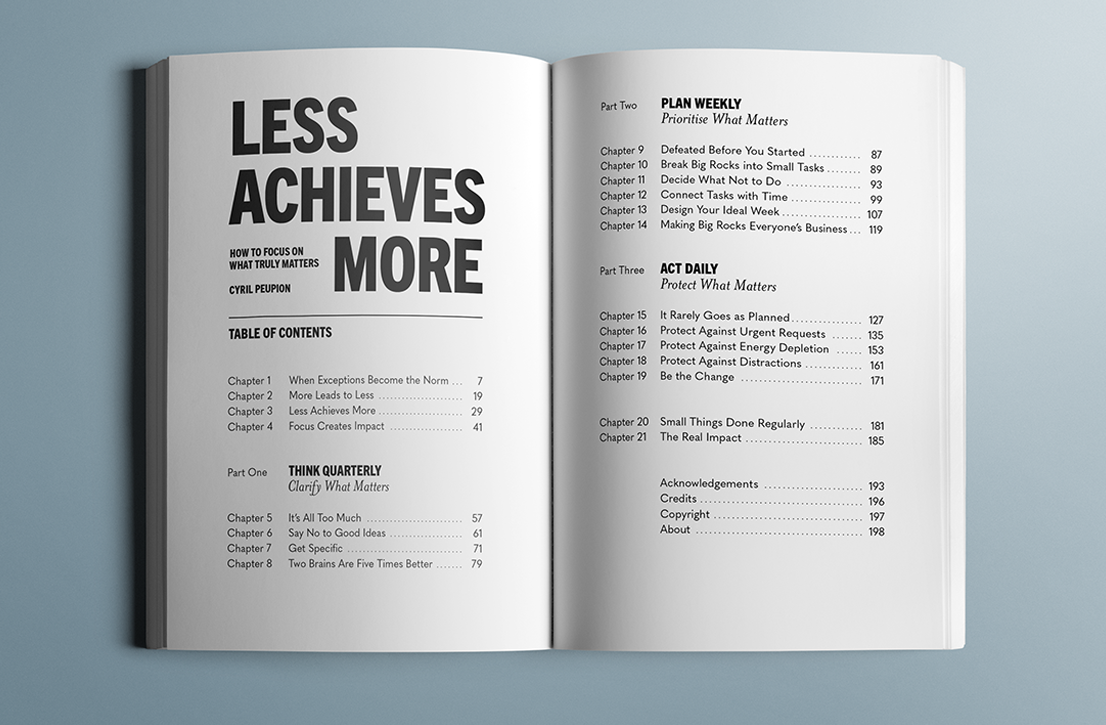
It’s easy to tell someone to “do less.” This book teaches you how. Cyril walks readers through setting clear, specific quarterly goals, building their weekly plans, and then fiercely protecting their time each day, so they can actually reach the goals they’ve defined. Fewer projects, fewer tasks, more impact.
We designed the book to reflect that message and make Cyril’s approach easy to take in. Our work included:
- Early reader copies for concept testing and refinement
- Book cover, interior design and composition
- Marketing visuals
New ideas about productivity deserve a book that doesn’t look like all the others. How do you design it?
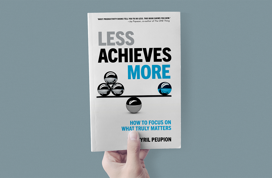
Go to the business section of any bookstore and you’ll see a lot of books on productivity and time management. Most of them are about getting more done. Bard Press wanted this one to feel different, because its message is different. We wanted every design decision to reflect the concept that less achieves more.
The cover was the hardest part. How do you say “less is more” visually without falling into clichés? We explored dozens of concepts, color studies, and both image-driven and type-driven options. Three directions made the final cut, and a reader survey confirmed that our top choice was the one that resonated most. It’s a cover that makes people stop and think about the meaning.
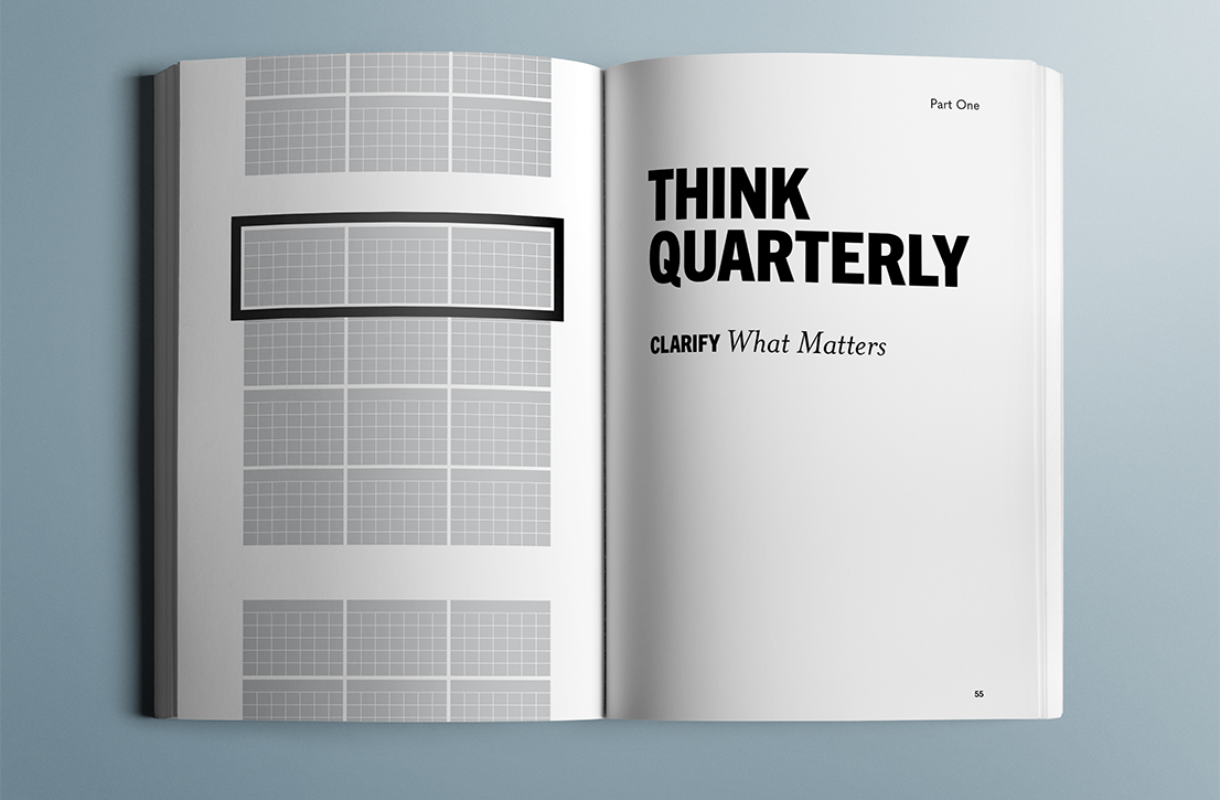
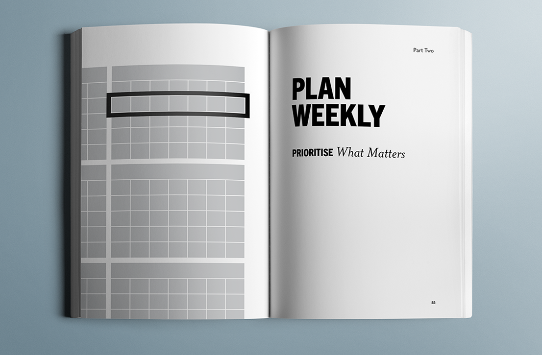
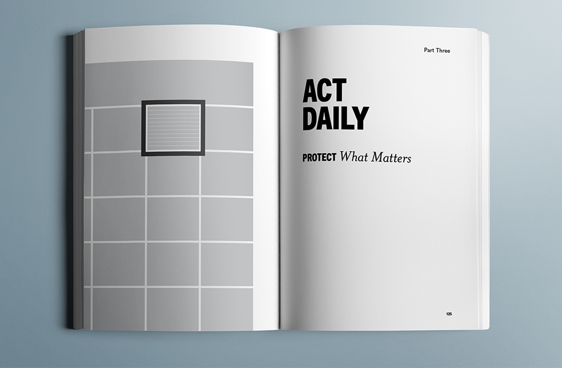
nside, abstract calendar visuals open each chapter. As the book moves from the quarter to the week to the day, the view zooms in to match the reader’s narrowing focus, a bit like Charles and Ray Eames’s film Powers of Ten. The visuals are unadorned, with only as much detail as needed for clarity.
After several rounds of typographic studies, we chose three typefaces with specific roles and high contrast. Paired with a strong visual logic, they create a hierarchy that moves readers through the material easily.
Books are manufactured objects. Good book design reflects the author’s approach and voice, and it also has to meet a long list of practical requirements. Cyril leads trainings around the world, and his clients need books wherever those trainings happen, so Less Achieves More had to be printable just about anywhere. We designed the interior in black and white, testing tints along the way to make sure the quality would hold up from one printer to the next. That makes it easy to print locally, close to where readers are, and still have the book look and work the way it should.
Got a book idea that could help people work better and live better? Let’s talk.